


You have spent hours designing the perfect graphic for your apparel line, uploaded it to your printer, and eagerly awaited your DTF transfers. But when they arrive, the colors look off, edges are blurry, and details have disappeared. This frustrating scenario happens because most businesses assume any artwork file works for DTF printing. The reality is that DTF transfers demand specific file formats, resolution standards, color modes, and layout considerations to produce vibrant, sharp prints. This guide breaks down the exact artwork requirements you need to achieve professional quality DTF transfers every time, eliminating guesswork and wasted materials.
Table of Contents
- Key takeaways
- Understanding file formats and resolution for DTF artwork
- Color modes and white underbase requirements in DTF artwork
- Artwork sizing, bleed, and layout considerations for DTF transfers
- Best practices and common pitfalls in preparing DTF artwork
- Explore DIYPRINTZ DTF transfer solutions
- What file formats are best for DTF artwork?
- Why is CMYK color mode important for DTF prints?
- How much bleed should I include in my DTF artwork?
- Do I need to provide white underbase separately in my artwork files?
Key Takeaways
| Point | Details |
|---|---|
| DPI 300 requirement | Use at least 300 DPI resolution to ensure sharp prints at the intended size. |
| CMYK color mode | Convert RGB artwork to CMYK before submission to match printer ink colors. |
| Vector or high res PNG | Provide vector AI or EPS files or if unavailable use high resolution PNG with a transparent background and 300 DPI. |
| Transparent backgrounds | Preserve transparency so ink is applied only where the design exists and avoids white boxes. |
| White underbase margins | Indicate where white underbase should appear and account for transfer margins to prevent color bleed on dark fabrics. |
Understanding file formats and resolution for DTF artwork
The foundation of quality DTF prints starts with choosing the right file format and resolution. Vector files like AI (Adobe Illustrator) and EPS offer the best results because they use mathematical paths rather than pixels, meaning you can scale them infinitely without losing quality. When a print shop needs to adjust your design size, vector artwork maintains every sharp edge and smooth curve perfectly.
If vector files are not available, high resolution PNG files with transparent backgrounds serve as the next best option. The critical specification here is 300 DPI resolution, which ensures your design contains enough detail to print sharply at the intended size. Lower resolution files, especially JPGs downloaded from websites or social media, contain too few pixels and result in blurry, pixelated prints that look unprofessional on garments.
Transparency is equally important for PNG files. A transparent background allows the DTF printer to apply ink only where your design exists, creating clean transfers without white boxes or rectangles around your artwork. When you save PNG files, always enable the transparency option in your design software to preserve this critical feature.
Pro Tip: Before submitting artwork, zoom to 100% on your screen and examine fine details like small text or thin lines. If elements look fuzzy or jagged at actual size on screen, they will print poorly. Request higher resolution source files or simplify complex details that won’t reproduce well.
Common file format mistakes include submitting low resolution JPGs, using RGB color mode instead of CMYK, or providing files with white backgrounds that create unwanted boxes around designs. Taking time to prepare files correctly from the start saves money, materials, and the frustration of reprinting failed transfers.
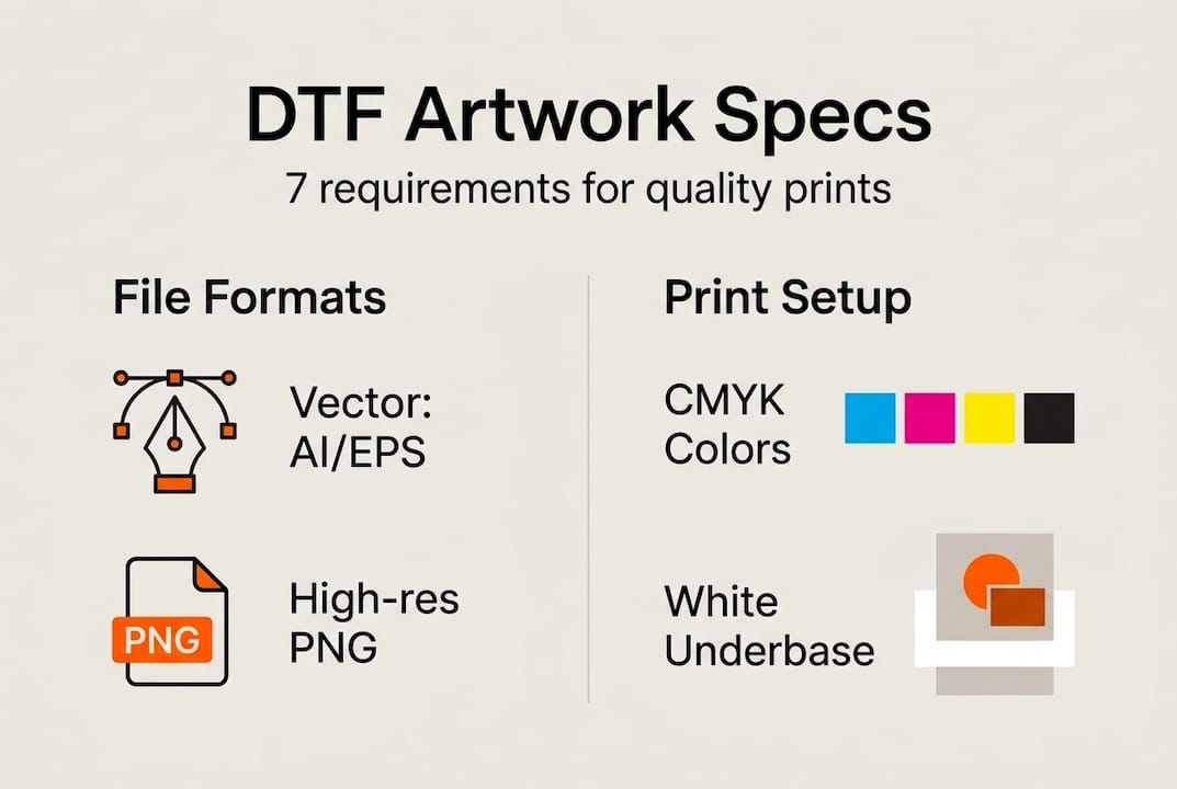
Color modes and white underbase requirements in DTF artwork
Color accuracy separates amateur looking prints from professional results, and it all starts with using the correct color mode. DTF printers operate using CMYK ink systems, which stands for cyan, magenta, yellow, and black. When you design artwork in RGB mode (red, green, blue), the colors you see on screen won’t match what prints because RGB is designed for digital displays, not physical printing.
Converting RGB artwork to CMYK before submission ensures the colors you envision are the colors that print. This conversion happens in design software like Adobe Photoshop or Illustrator through the color mode settings. Some vibrant RGB colors, particularly bright blues and greens, cannot be exactly replicated in CMYK, so converting early lets you adjust your design to achievable print colors rather than being surprised by shifts later.
The white underbase layer is the secret ingredient that makes DTF prints pop on dark garments. Unlike screen printing where white ink prints first, DTF technology prints white ink as part of the transfer film itself. This white layer sits beneath your colored inks, blocking the dark fabric and allowing your design colors to appear vibrant and true rather than muted or transparent.
| Aspect | RGB | CMYK |
|---|---|---|
| Purpose | Digital screens and displays | Physical printing processes |
| Color range | Wider gamut, brighter colors | Print achievable colors |
| DTF compatibility | Causes color shifts when printed | Matches printer ink system |
| Best use | Web graphics, digital art | Print ready artwork |
When preparing artwork, clearly indicate where white underbase should appear or provide a separate layer showing white areas. For designs going on dark garments, the entire design typically needs white underbase. For light colored garments, you may skip white underbase to let the fabric show through, creating a softer feel.
Pro Tip: Create a separate white underbase layer in your design file that extends slightly beyond your color artwork edges. This small overlap, called choking, ensures no gaps appear between the white base and colors, preventing the dark garment from showing through and creating unwanted outlines.
Artwork sizing, bleed, and layout considerations for DTF transfers
Precise sizing prevents the most common and costly DTF printing mistakes. Always create your artwork at the exact dimensions you want the final print to be. If you need a 12 inch wide design on a shirt, create your file at exactly 12 inches wide at 300 DPI. Scaling artwork up or down during printing can introduce quality issues, even with vector files, and almost always degrades raster images like PNGs.

Bleed is the extra artwork area extending beyond your design edges, typically 1/8 to 1/4 inch on all sides. This buffer zone accounts for slight variations in cutting and ensures your design prints completely to the edges without white gaps. Proper bleed prevents alignment issues that occur when transfers are trimmed and applied to garments.
Here is how to set up artwork sizing and layout correctly:
- Determine your final print size in inches (width and height).
- Set your design software canvas to those exact dimensions.
- Add 1/8 to 1/4 inch bleed area beyond all edges where design extends to borders.
- Keep critical text and design elements at least 1/4 inch inside the trim line.
- Consider garment seams and placement, keeping designs away from side seams and armholes.
- Export at 300 DPI with bleed area included and provide trim marks if needed.
Layout considerations extend beyond just size. Think about where the transfer will be placed on the garment. Center chest designs work best between 10 to 14 inches wide for adult shirts. Left chest designs typically measure 3 to 4 inches. Back designs can go larger, up to 14 inches wide, but should stay several inches below the collar and above the hem.
| Common mistake | Correct approach |
|---|---|
| Creating artwork at random size, expecting printer to scale | Design at exact final print dimensions |
| No bleed area, design ends at trim line | Include 1/8 to 1/4 inch bleed beyond edges |
| Important text touching design edges | Keep critical elements 1/4 inch inside trim |
| Ignoring garment construction | Account for seams, avoid armhole and side seam areas |
| Using screen dimensions instead of print size | Always work in physical inches at 300 DPI |
Garment type also affects sizing decisions. Youth sizes need proportionally smaller designs. Oversized or fashion fit shirts may require adjusting standard placement. Always communicate with your print provider about intended garment types and placements to ensure artwork sizing matches your vision.
Best practices and common pitfalls in preparing DTF artwork
Successful DTF artwork preparation combines technical specifications with practical workflow habits. Always proof your artwork on screen at 100% zoom before submitting files. This simple step reveals issues like insufficient resolution, misaligned layers, or transparency problems that are easy to fix before printing but costly to discover after transfers are produced.
Confirm every technical specification before saving final files. Check that color mode is set to CMYK, resolution is 300 DPI, background is transparent for PNGs, and white underbase layers are properly separated or marked. These verification steps take seconds but prevent the majority of print quality issues.
Complex gradients and photographic effects often disappoint in DTF printing. While modern DTF technology handles gradients better than older methods, subtle color transitions can appear banded or stepped rather than smooth. Simplify gradients when possible or use solid colors for more predictable results. Drop shadows and glows may not reproduce as expected, so preview these effects carefully or avoid them in critical design areas.
Here are the top 5 artwork mistakes that cause DTF printing problems:
- Submitting RGB files instead of CMYK, causing unexpected color shifts
- Using low resolution images below 300 DPI, resulting in blurry prints
- Forgetting to include bleed area, creating white gaps at design edges
- Providing files with white backgrounds instead of transparency
- Placing small text or fine details that are too small to print clearly
Pro Tip: Establish a pre flight checklist for every artwork file you submit. Include items like file format, resolution, color mode, transparency, bleed, and white underbase. Running through this checklist before uploading files catches errors when they are still easy to fix and builds habits that consistently produce quality results.
“Proper file preparation is the difference between DTF transfers that exceed expectations and ones that disappoint. Taking time to set up artwork correctly, with appropriate resolution, color mode, and layout specifications, ensures consistent, high quality prints and minimizes waste from reprints and errors.”
Communicate clearly with your DTF printer about file specifications and transfer expectations. Different printers may have specific preferences for how white underbase is provided or particular file naming conventions. Asking questions upfront prevents misunderstandings and ensures your artwork is processed exactly as intended.
Explore DIYPRINTZ DTF transfer solutions
Now that you understand the precise artwork requirements for quality DTF prints, you need a reliable printing partner who delivers consistent results. DIYPRINTZ specializes in producing hundreds to thousands of DTF transfers monthly for print shops, apparel brands, and businesses that want professional quality without owning expensive equipment.
Our same day DTF transfers auto gang sheet service simplifies the entire process. Upload your properly prepared artwork, and our system efficiently arranges designs for printing, maximizing material usage and minimizing costs. You receive ready to press transfers that meet exact specifications, backed by our expertise in file preparation and quality control.
Whether you need small runs for testing designs or bulk production for large orders, DIYPRINTZ handles the technical complexity of DTF printing so you can focus on growing your brand. Visit our site to explore additional guides, submit your artwork, and discover why businesses trust us for their custom apparel printing needs.
What file formats are best for DTF artwork?
Vector formats like AI (Adobe Illustrator) and EPS provide the best results for DTF printing because they scale infinitely without quality loss. High resolution PNG files with transparent backgrounds serve as excellent alternatives when vector files are not available. Avoid submitting JPG files, especially those downloaded from websites or social media, as they typically lack sufficient resolution and include compression artifacts that degrade print quality. Always save PNG files with transparency enabled to prevent unwanted white boxes around your designs.
Why is CMYK color mode important for DTF prints?
DTF printers use CMYK ink systems (cyan, magenta, yellow, black) rather than RGB (red, green, blue) color models designed for digital screens. Artwork created in RGB mode will experience color shifts when printed because the printer must convert colors to its CMYK ink set, often producing unexpected results. Designing in CMYK from the start ensures the colors you see during creation closely match the final printed colors. This is especially critical for brand colors and designs where color accuracy matters for professional appearance and customer satisfaction.
How much bleed should I include in my DTF artwork?
Include 1/8 to 1/4 inch of bleed beyond your design edges to account for cutting and alignment variations during transfer production and application. Bleed ensures your design prints completely to the edges without white gaps appearing if the cut is slightly off center. Extend any background colors or design elements that touch the edges into the bleed area. Keep important design elements like text and logos at least 1/4 inch inside the trim line to prevent them from being accidentally cut off. Providing artwork with proper bleed demonstrates professional file preparation and prevents costly reprints from alignment issues.
Do I need to provide white underbase separately in my artwork files?
White underbase requirements vary by printer, so always confirm preferences with your DTF provider. Some printers prefer a separate layer in your file clearly labeled as white underbase, while others can generate it automatically from your color artwork. For designs on dark garments, white underbase typically covers the entire design area to ensure color vibrancy. On light garments, you may skip white underbase for a softer feel. When creating a separate white underbase layer, extend it slightly beyond your color artwork edges (called choking) to prevent gaps where the dark garment shows through between the white base and colored inks.